A website can reassure a customer... or make them leave in a few seconds.
The problem is that many companies think they have a decent website, while in reality, certain details create an unprofessional impression.
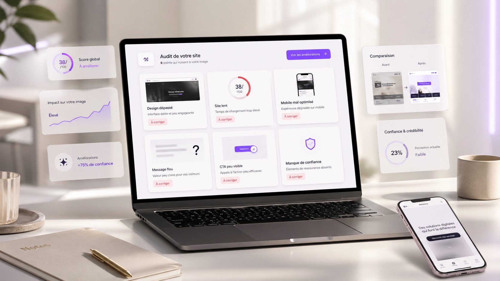
Outdated design, unclear copy, slow pages, poor mobile experience, invisible buttons... These mistakes may seem small, but they can cost you prospects.
Your website is often the first impression people have of your company. It must therefore inspire trust within the first few seconds.
Outdated design
Design is often the first thing people notice.
If your website looks old, misaligned or visually dated, visitors may feel that your company is not up to date.
Even if your services are excellent, your image can be weakened by a website that no longer reflects your level of professionalism.
Modern design does not necessarily mean a complicated website.
It should mainly be clear, clean, consistent and pleasant to browse.
Copy that is too vague
A visitor must quickly understand what you offer.
If your copy is too vague, too long or too technical, they may lose interest.
Phrases like we offer innovative solutions adapted to your needs are not always enough. You need to be concrete.
The visitor must know:
- what you do
- who you do it for
- what you can bring them
- how to contact you
A good website uses simple words, clear messages and titles that are easy to understand.
A website that is too slow
A slow website immediately creates a poor impression.
Today, internet users do not like waiting. If a page takes too long to load, many leave before even reading the content.
A slow website can also suggest that the company lacks seriousness or that the website is not maintained.
Images that are too heavy, poorly optimized animations, weak hosting or bloated code: the causes can be numerous.
But the result is the same: you lose visitors.
A poor mobile version
A large share of visitors browse websites from a phone.
If your website is hard to read on mobile, that is a real problem.
Text that is too small, buttons that are too close, overflowing images, complicated menus, forms that are hard to fill out... all these details create frustration.
And when the experience is bad, visitors do not search for long. They leave.
A professional website must feel pleasant on desktop, tablet and mobile.
Information that is hard to find
A website must guide the visitor.
If they have to search for several minutes to find your services, prices, service area or contact form, they may leave the page.
Navigation must be simple.
The visitor should quickly find important information:
- your services
- your work
- customer reviews
- your contact details
- your contact form
- your call to action
The smoother the journey, the more the visitor trusts you.
Missing or poorly placed calls to action
A website can be beautiful but ineffective.
If visitors do not know what to do after reading your pages, you lose an opportunity.
A good website should naturally guide them towards an action:
- Request a quote
- Book a call
- Contact us
- View our work
- Discover our services
Buttons must be visible, clear and well positioned.
The goal is not to force the visitor. The goal is to make taking action easier.
Low-quality images
Images play an important role in how a website is perceived.
Blurry, poorly framed, overly generic or low-quality photos can make the website look unprofessional.
On the other hand, strong visuals immediately reinforce credibility.
They make the website feel more pleasant, premium and reassuring.
Even with a simple design, good visuals can make a real difference.
A website that shows no proof
Saying you are professional is good. Proving it is better.
A website without customer reviews, work examples, case studies or reassuring elements can lack credibility.
Visitors want to see proof.
They want to know whether other customers have already trusted you. They want to understand the way you work. They want to see what you are capable of producing.
Adding reviews, completed projects, key figures or testimonials can strongly improve trust.
Pages that are not up to date
A website with old information can create an impression of abandonment.
Outdated dates, services that are no longer offered, broken links or very old news can make visitors doubt you.
They may wonder whether the company is still active.
A professional website must be checked and updated regularly.
Even small corrections can prevent a poor impression.
An inconsistent visual identity
Different colors, poorly chosen fonts, mixed styles, buttons that do not look alike... all these details can create a messy impression.
A consistent visual identity makes the website look more serious.
It helps visitors recognize your brand, understand your positioning and perceive you as an organized company.
Consistency builds trust.
Conclusion
A website can increase credibility, but it can also damage your image if it is poorly designed.
Outdated design, slow loading, poor mobile experience, vague copy or information that is hard to find can drive prospects away without you realizing it.
The good news is that these mistakes can be fixed.
By improving clarity, design, speed, mobile experience, calls to action and trust signals, your website can become much more professional.
Your website should not simply exist.
It should reassure, convince and make people want to contact you.